Designing systems.
Shipping products.

Ten years turning data into decisions at Cigna, Salesforce, and Deloitte — now designing and engineering live products for Web3 ecosystems, an acclaimed digital artist, and one very hungry family.

Previously — Cigna · Salesforce · Deloitte | Harvard Business Analytics · MBA, Finance

Selected work

Case studies in systems that ship

Every project below was designed, built, and delivered end-to-end — information architecture, visual system, and the production code behind it.

01 — Ecosystem visualization

LUCI Explorer

Design & build · On-chain data · Visit live →

The problem. Sam Spratt's LUCI universe spans four collections and 929 tokens — ten 1/1 paintings, fifty gifted skulls, 256 Monument Game players, 613 masks — but its ownership stories lived scattered across contracts and marketplaces, invisible as a whole.

Design decisions. After a phone call with Sam about overhauling his site, I shipped this explorer as my vision for the redesign: the ecosystem as a heliocentric system — the 1/1s at the center, each layer orbiting outward in the order the world grew. Sam adopted the heliocentric model as a central part of his new design. The map is navigable — hover any token and its collector's network lights up; click through to a collector dossier — and the rings were engineered to render live on-chain data via Alchemy's NFT API, a feed I've since retired to a snapshot to keep an unofficial community tool cheap to run.

Shipped result. A community tool for exploring a $12M+ art ecosystem — 929 tokens, 81 cross-layer collectors — that reads like a map of belonging rather than a block explorer.

10 LUCI 1/1s  ·  50 Skulls  ·  256 Monument  ·  613 Masks
02 — Market intelligence

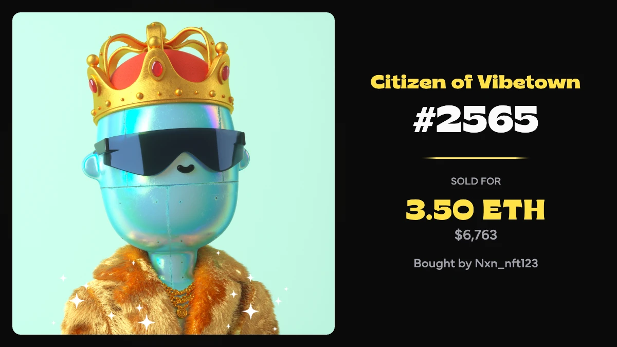
Good Vibes Club Analytics

Strategic advisor · Auto-updating · Visit live →

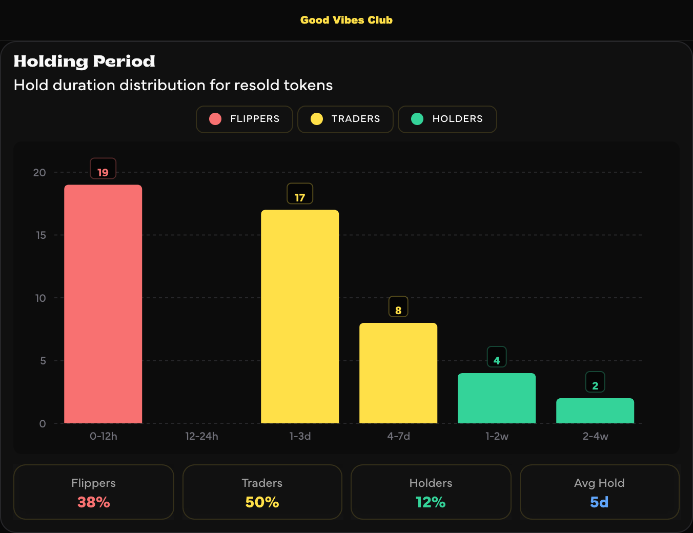
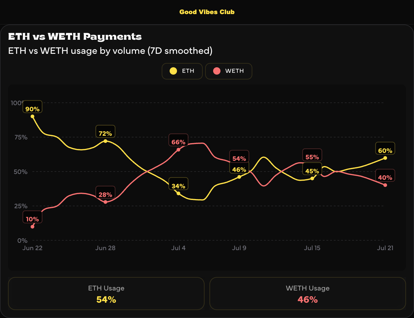
The problem. Good Vibes Club — a 1,600-holder NFT community from animation studio Toast — needed one honest, always-current picture of its market: sales, holders, liquidity, whales. Nobody should have to compile a report.

Design decisions. A numbered editorial system (01 Price & Volume through 04 Collection Health) turns a dashboard into a publication regulars learn to read. Every visualization has an export button — and it doesn't hand you a screenshot, it renders a socially optimized graphic: branded, annotated, and sized for the feed, so any chart or sale is one tap from being shared. ETH/USD and time-range toggles persist across the page. The site refreshes itself and says so — "Updated 18m ago" is a design element, because trust in data is trust in timestamps.

Shipped result. 13,878 ETH (~$26.8M) of market history live at a glance.

03 — Executive dashboards

Defi App

Strategic advisor · Top-5 DEX by volume · Automated reporting

The problem. A top-5 decentralized exchange — $10B in transaction volume, 300,000+ users onboarded — was limited on analyzing growth due to scattered ad-hoc queries.

Design decisions. Executive views styled like finished presentation slides but wired straight to the database — one click refreshes the whole deck. Day-over-day deltas are annotated on every bar so trend and rate arrive together. Users are bucketed by XP earned, exposing the silent majority a topline average hides.

Shipped result. Weekly hours of manual deck-building, gone — and the XP-bucket view surfaced most users transacting near zero, the analysis behind my recommendation for threshold-based incentive rewards.

04 — Live game operations

Death & Taxes Command Center

Design & build · On-chain game tracker · Visit live →

The problem. Artist m0dest's on-chain elimination game — 6,969 citizens paying taxes, auditing rivals, buying insurance, surviving — had all of its drama locked inside raw transactions.

Design decisions. A bureaucratic terminal: phosphor green on black, tabulated activity logs, a ticking treasury counter. The interface itself delivers the game's deadpan joke — nothing is certain except death and taxes. Kill leaderboards come from a subgraph, every state is verified on-chain, and the room refreshes every 30 seconds so it always feels inhabited.

Shipped result. The community's shared window on the game — day 143, 99.5% eliminated, 69 survivors, an 816 ETH treasury — designed to be watched like a scoreboard.

DEPT OF DEATH LIVE
DAY: 143 TAX RATE: 0.09867 ETH POPULATION: 105 / 6,969 TREASURY: 816.5909 ETH
ELIMINATION PROGRESS6864 / 6,900 ELIMINATED
99.5%

[23 JUL 00:54:11]  CITIZEN #6475 PAID TAXES THROUGH DAY 149.

[23 JUL 00:00:11]  CITIZEN #408 AUDITED CITIZEN #1751.

[22 JUL 23:59:59]  CITIZEN #401 KILLED THE AUDIT AGAINST THEM.

Interface recreation — the live tracker at m0dest-command-center.vercel.app

05 — Consumer product

What Should We Make

Design & build · Free forever · Visit live →

The problem. Meal planning was a thirty-minute Sunday negotiation that ended in the same five boring dinners.

Design decisions. The whole product is one promise — plan your family's meals in 60 seconds — and every screen supports it. Pick dinners from 225+ curated recipes (or import your own from any site), pair sides that quietly track your plate's color variety, then one tap produces an organized grocery list. Friendly, rounded, zero-jargon — designed for the least technical person in the household.

Shipped result. Live and free — no credit card, no subscription — and wired to an autonomous agent (OpenClaw) that can turn the week's list into a placed Instacart order.

06 — Automated research platform

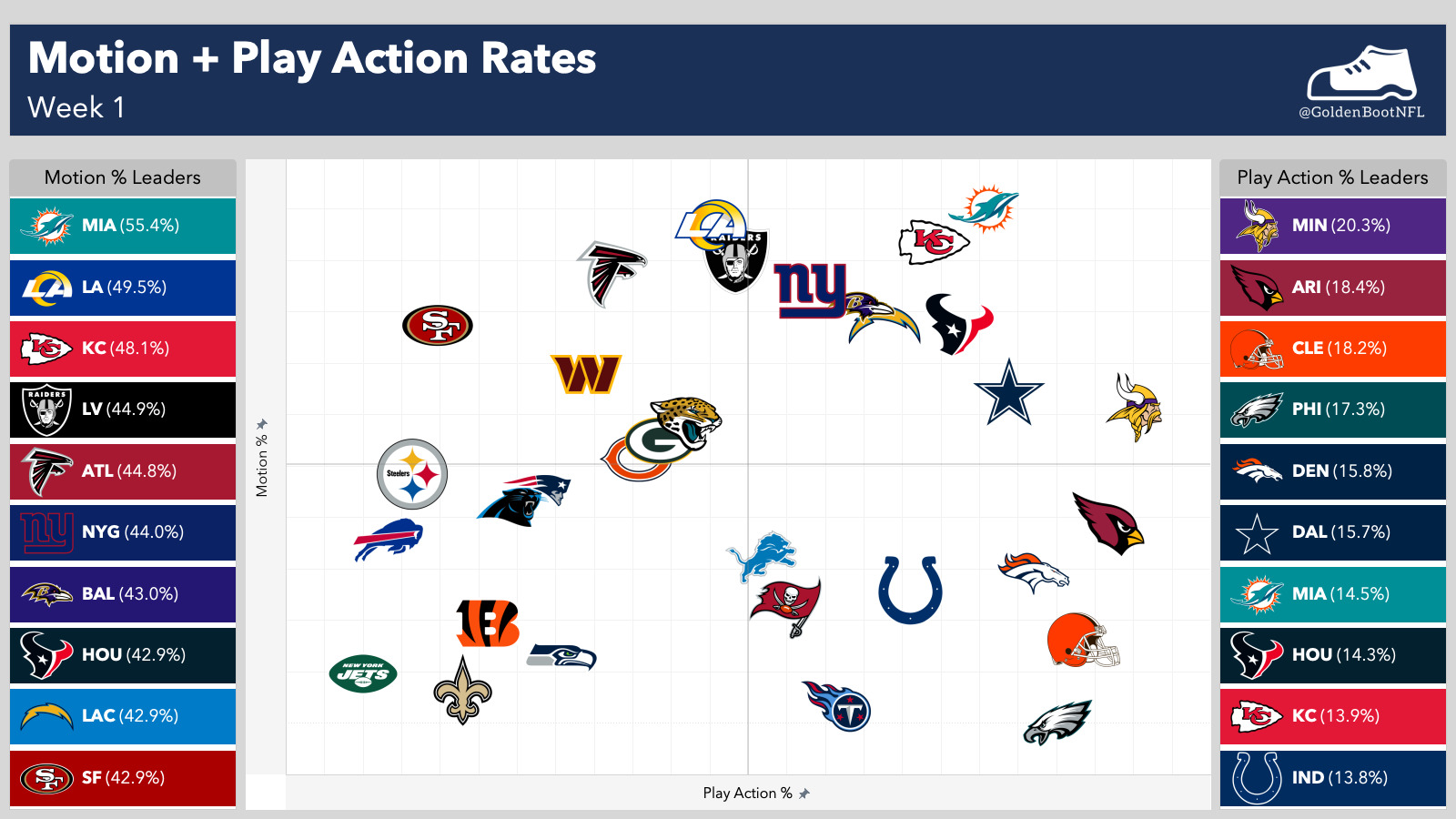
Golden Boot

Design system · NFL / fantasy analytics · @GoldenBootNFL

The problem. NFL research expires weekly. Publishing it by hand — new charts, new layouts, every week — doesn't scale past a hobby.

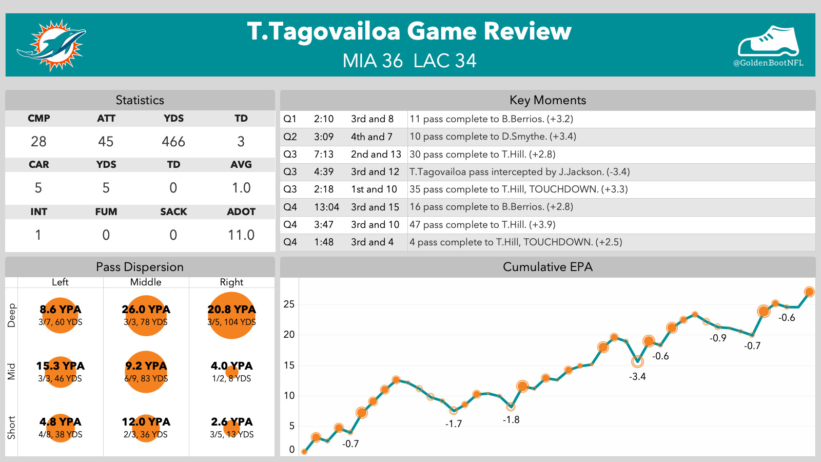
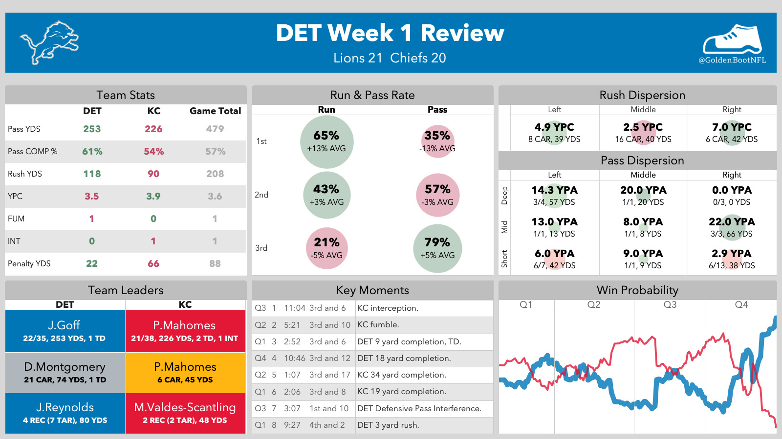
Design decisions. One visual grammar, expressed across every data shape: team-colored bars, a constant header band, the boot mark in the corner. Consensus-ranking boards, single-game reviews with cumulative EPA and pass-dispersion grids, league-wide tendency quadrants — each is a template that renders publication-ready straight from the data.

Shipped result. An automated research platform that turns each NFL week into finished graphics. Same system, any story — the design-system instinct applied to sports data.

Process

How the work gets made

I

Design the foundation

Every build starts with the bones — the backend infrastructure, the data model, and a first-draft layout that respects both. It's the instinct I honed at Salesforce, where I owned the BI department's Tableau environment and standardized its templates, unifying our brand identity and eliminating project bloat. Define the design once, and every update arrives already matching it.

II

Refine as you build

The first draft never survives the build — the design keeps tightening in code until it feels right. Information architecture, visual system, interaction, then production code with Claude Code and agentic workflows. Every case study above shipped without a handoff; engineering isn't a blind spot for me — I'm happy to dive into the weeds, or build alongside other engineers.

III

Let the data judge the work

Delivery is the start of the critique, not the end. At Cigna, A/B testing drove double-digit gains in customer satisfaction for complex-care populations; self-serve dashboards at Salesforce returned ~32 analyst-hours a week. The metric I design for: do people keep coming back? If not, it isn't finished yet.

About

Analyst by training, designer-builder by conviction

I'm Dan — based in Ohio, and proud of it! I spent a decade leading analytics at Cigna, Salesforce, and Deloitte, studied Business Analytics at Harvard as the program's second-youngest graduate, and hold an MBA in Finance. Since 2025 I've advised Good Vibes Club and Defi App on strategy while designing and shipping the products on this page.

I'm also Web3-native the unglamorous way: years of collecting and trading — CryptoPunks, Bored Apes, Pudgy Penguins — living inside the marketplaces and wallets I now design for. That's the perspective I bring: the systems thinking of an analyst, the taste of a collector, and the shipping habit of a builder.

Contact

Let's make something
people come back to.